Widgets
Content widgets
Callout
List
Image
Text on image
Video
Audio
Divider
Interactive widgets
Image carousel
Checkboxes
Slides
Tabs
Flip cards
Labeled graphic
Knowledge check widgets
Single answer
Multiple answers
Fill in
Sorting
Hidden area
Advanced widget
HTML
Each widget has settings which can be accessed in the top right corner of the widget.
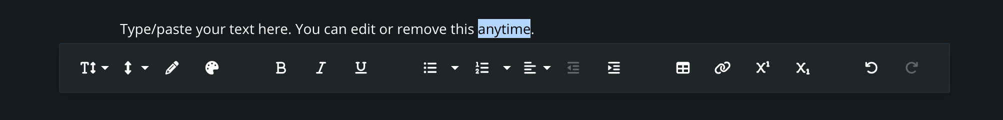
Text widget
Text widget allows you to format text. The following formatting options are supported:
- Font size
- Paragraph format
- Line height
- Text color
- Background color
- Bold
- Italic
- Underline
- Unordered list: circle, disc, square
- Ordered list: lower alpha, lower greek, lower roman, upper alpha, upper roman
- Alignment: left, center, right, justify
- Indent: increased, decreased
- Table
- Link
- Superscript
- Subscript
- Undo text
- Redo text
The text widget has the following settings:
- Display delay: set a delay for when the widget becomes visible on the screen.
- Text widget can be turned into Note.
⚠️ Note: Display delay works only when restrictions are applied.
List widget
The List widget enables you to create visually appealing bullet points, numbered lists and checkboxes. It offers the same text formatting capabilities as the Text widget.
The List widget has the following settings:
- List Color: customize the color of bullet points and numbers.
- Indentation: adjust spacing between list items with options S (small), M (medium), L (large).
- Display Delay: set a delay for when the widget becomes visible on the screen.
⚠️ Note: Display delay works only when restrictions are applied.
Image widget
Image widget allows you to upload a JPG or PNG file. If the file exceeds 1024KB, the image width will be automatically resized down to 3000px, and image quality will be compressed to 60%. This process happens during the upload and it improves user experience.
The image widget has the following settings:
- Alignment: left, center, right
- Width: defines a percentage width of the image within a predefined layout
- Round corners
- Caption
- Display delay: delays visibility of the widget on the screen
⚠️ Note: Display delay works only when restrictions are applied.
Text on image
The Text on Image widget allows you to upload a custom image and place formatted text over it. You can select any image from your media library as a background, and then apply rich text formatting directly on top.
This widget is ideal for banners, titles, or highlighted content blocks where you want text and imagery to blend together.
The text editor supports the following formatting options:
- Paragraph format
- Font size
- Line height
- Text color
- Background color
- Bold, Italic, Underline
- Unordered list: circle, disc, square
- Ordered list: lower alpha, lower Greek, lower Roman, upper alpha, upper Roman
- Alignment: left, center, right, justify
- Indentation: increase, decrease
- Tables
- Links
- Superscript, Subscript
- Undo / Redo
⚠️ Note: Display delay works only when restrictions are applied.
Tip: For best visual results, use high-contrast combinations of text and background image.
Video widget
Video widget allows you to insert video to the course in three different ways.
- URL: embed online videos using URL address (recommended for YouTube and Vimeo)
- Embed code
- Media library: upload your own video in MP4 or MOV file format
Depending on the option chosen above, video widget has the following settings:
- Alignment: left, center, right
- Width: defines a percentage width of the image within a predefined layout
- Playback options: play automatically, loop video, mute video
- Video controls: disable fast-forwarding, hide video controls
- Display delay: delays visibility of the widget on the screen
⚠️ Note: Display delay works only when restrictions are applied.
Learners can choose the playback speed of the video: x0.75, normal, x1.25, x1.5.
PDF widget
PDF widget allows you to upload PDF files.
The PDF widget has the following settings:
- Alignment: left, center, right
- Display mode:
- inside content - the PDF appears on the page among other content
- open with button - the PDF is invisible until learner click on a button. PDF is then opened in another browser tab
- Allow download: allows learner to download PDF
- Display delay: delays visibility of the widget on the screen
⚠️ Note: Display delay works only when restrictions are applied.
Learner can zoom in the PDF, expand it full screen, or optionally download it.
Audio
The Audio widget allows you to play your own MP3 files directly on the page.
To use this widget, upload your generated audio file to the media library and select it from the widget settings.
Each audio clip can include a custom header text displayed above the player.
Playback is manual, which means that audio will only start when the user clicks the Play button.
⚠️ Note: Display delay works only when restrictions are applied.
Divider
The Divider widget adds a horizontal line to separate content visually.
You can adjust:
- thickness (S, M, or L)
- set a custom color to match your layout
⚠️ Note: Display delay works only when restrictions are applied.
Single answer widget
The Single answer widget allows you to create a question with two or more answer options, where only one option is correct.
The Single answer widget has the following features:
Question and Options
- Add a question with two or more answer choices
- Select one option as the correct answer
- Optionally add an image to the question and/or to each answer option
Behavior Settings
- Require completion: make the question mandatory to answer before proceeding
- Shuffle answers: randomize the order of answer options for each learner
- Reveal answer after submit: show the correct answer after the learner submits their response
- Repeat until correct: require the learner to select the correct answer before continuing
Feedback Settings
- Correct answer feedback: provide custom feedback when the learner chooses the correct answer
- Incorrect answer feedback: provide custom feedback for incorrect answers
Timing
- Display delay: set a time delay for when the widget appears on the screen
⚠️ Note: Display delay works only when restrictions are applied.
Multiple answers widget
The Multiple answers widget allows you to create a question with two or more answer options, where one or more options are correct.
The Multiple answers widget has the following features:
Question and Options
- Add a question with two or more answer choices
- Select one or multiple options as the correct answer
- Optionally add an image to the question and/or to each answer option
Behavior Settings
- Require completion: make the question mandatory to answer before proceeding
- Shuffle answers: randomize the order of answer options for each learner
- Reveal answer after submit: show the correct answer after the learner submits their response
- Repeat until correct: require the learner to select the correct answer before continuing
Feedback Settings
- Correct answer feedback: provide custom feedback when the learner chooses the correct answer
- Incorrect answer feedback: provide custom feedback for incorrect answers
Timing
- Display delay: set a time delay for when the widget appears on the screen
⚠️ Note: Display delay works only when restrictions are applied.
Fill in widget
The Fill in widget lets you create open-ended questions where learners type a short response. You can define one or more accepted answers that will be recognized as correct.
The Fill in widget has the following features:
Question and Options
- Add a question prompt where the learner enters a typed answer
- Define one or more correct answers
- Optionally add an image to the question
Behavior Settings
- Require completion: make the question mandatory to answer before proceeding
- Reveal answer after submit: show the correct answer after the learner submits their response
- Repeat until correct: require the learner to select the correct answer before continuing
- Case-sensitive answer comparison: choose whether answers are case-sensitive
Feedback Settings
- Correct answer feedback: provide custom feedback when the learner chooses the correct answer
- Incorrect answer feedback: provide custom feedback for incorrect answers
Timing
- Display delay: set a time delay for when the widget appears on the screen
⚠️ Note: Display delay works only when restrictions are applied.
Sortation widget
The Sortation widget allows learners to arrange items in the correct top-to-bottom order. It’s useful for testing understanding of sequences, procedures, or hierarchies.
The Sortation widget has the following features:
Question and Options
- Add a question prompt
- Enter multiple options and set the correct order
Behavior Settings
- Require completion: make the question mandatory to answer before proceeding
- Reveal answer after submit: show the correct answer after the learner submits their response
- Repeat until correct: require the learner to select the correct answer before continuing
Timing
- Display delay: set a time delay for when the widget appears on the screen
⚠️ Note: Display delay works only when restrictions are applied.
Hidden area widget
The Hidden area widget allows learners to identify and click on specific areas within a scene. It’s commonly used to test recognition or observation skills by asking learners to locate items, components, or features in a visual scene.
The Hidden area widget has the following features:
- Interactive areas: create one or more clickable zones in the image that act as correct answers. These are visually hidden but become active when learners interact with the scene.
- Instructions & guidance: add a custom prompt or description to guide learners on what they are expected to find.
- Initial camera position: define the view the learner sees when the assignment opens, helping focus attention on the relevant part of the scene.
- Require completion: make the Hidden area mandatory to perform before proceeding.
- Display delay: set a time delay for when the widget appears on the screen.
⚠️ Note: Display delay works only when restrictions are applied.
Image carousel
The Image Carousel widget allows you to present a sequence of images in a sliding, gallery-style format. It's ideal for showcasing visual content, step-by-step illustrations, or product views in the interactive experience.
The Image Carousel widget has the following features:
- Image selection: upload images to the media library and choose which one to include in the carousel slide.
- Slides: create individual slides, each displaying one image.
- Captions: add descriptive text or labels to each image for added context.
- Full-screen view: double-click any image to open it in full-screen mode.
- Require completion: make the widget mandatory to view or interact with before continuing to the next slide.
- Manual navigation: users can scroll through the images at their own pace using the navigation arrows.
⚠️ Note: Display delay works only when restrictions are applied.
Tabs
The Tabs widget allows you to organize content into multiple tabs within the same section, making it easier to present information in a structured and compact way. It's especially useful for grouping related content like step-by-step guides, or product features.
The Tabs widget has the following features:
- Multiple tabs: create and label multiple tabs to organize content logically.
- Rich text & media: add text, images, and formatting inside each tab (Check Text widget and Image widget).
- Navigation: users can click through tabs at their own pace using the navigation arrows or tab titles.
- Require completion: make the widget mandatory to interact with before moving forward.
- Display delay: delay the visibility of the widget by a set number of seconds after the screen loads.
⚠️ Note: Display delay works only when restrictions are applied.
Flip cards widget
The Flip cards widget is an interactive and customizable tool ideal for reinforcing knowledge and promoting active recall. Learners can explore content at their own pace by flipping cards to reveal hidden information. This makes it especially effective for reviewing definitions, processes, or visual comparisons.
The Flip cards widget has the following features:
- Rich text: add formatted text to both the front and back of each card. Text formatting options are the same as in the Text widget.
- Images: you can use an image instead of text on either side of the flip card.
- Multiple cards: add multiple flip cards within a single widget.
- Require completion: make the Flip cards mandatory to interact with, before proceeding.
- Display delay: set a time delay for when the widget appears on the screen.
⚠️ Note: Display delay works only when restrictions are applied.
Labeled graphic widget
The Labeled graphic widget lets you upload an image and place interactive hotspots on top of it. This allows learners to explore specific areas of the image and view additional information by clicking on the hotspots.
The Labeled graphic widget has the following features:
- Interactive hotspots: add one or more hotspots by clicking directly on the image. Each hotspot can display content when clicked.
- Customizable content: each hotspot has a title, a description (supports the same formatting options as the Text widget), and an image
- Hotspot icon: choose from various icons to represent the hotspot visually.
- Require completion: make the Labeled graphic mandatory to interact with, before proceeding.
- Display delay: set a time delay for when the widget appears on the screen.
⚠️ Note: Display delay works only when restrictions are applied.
Checkboxes widget
The Checkboxes widget lets you add one or more checkbox items with accompanying text. This can be used to create a simple to-do list for learners to check off while progressing through the content.
The Checkboxes widget has the following settings:
- The Checkboxes Widget can be turned into the List widget.
- Indentation: adjust spacing between list items with options S (small), M (medium), L (large).Require completion: make the Checkboxes mandatory to check, before proceeding.
- Display Delay: set a delay for when the widget becomes visible on the screen.
⚠️ Note: Display delay works only when restrictions are applied.